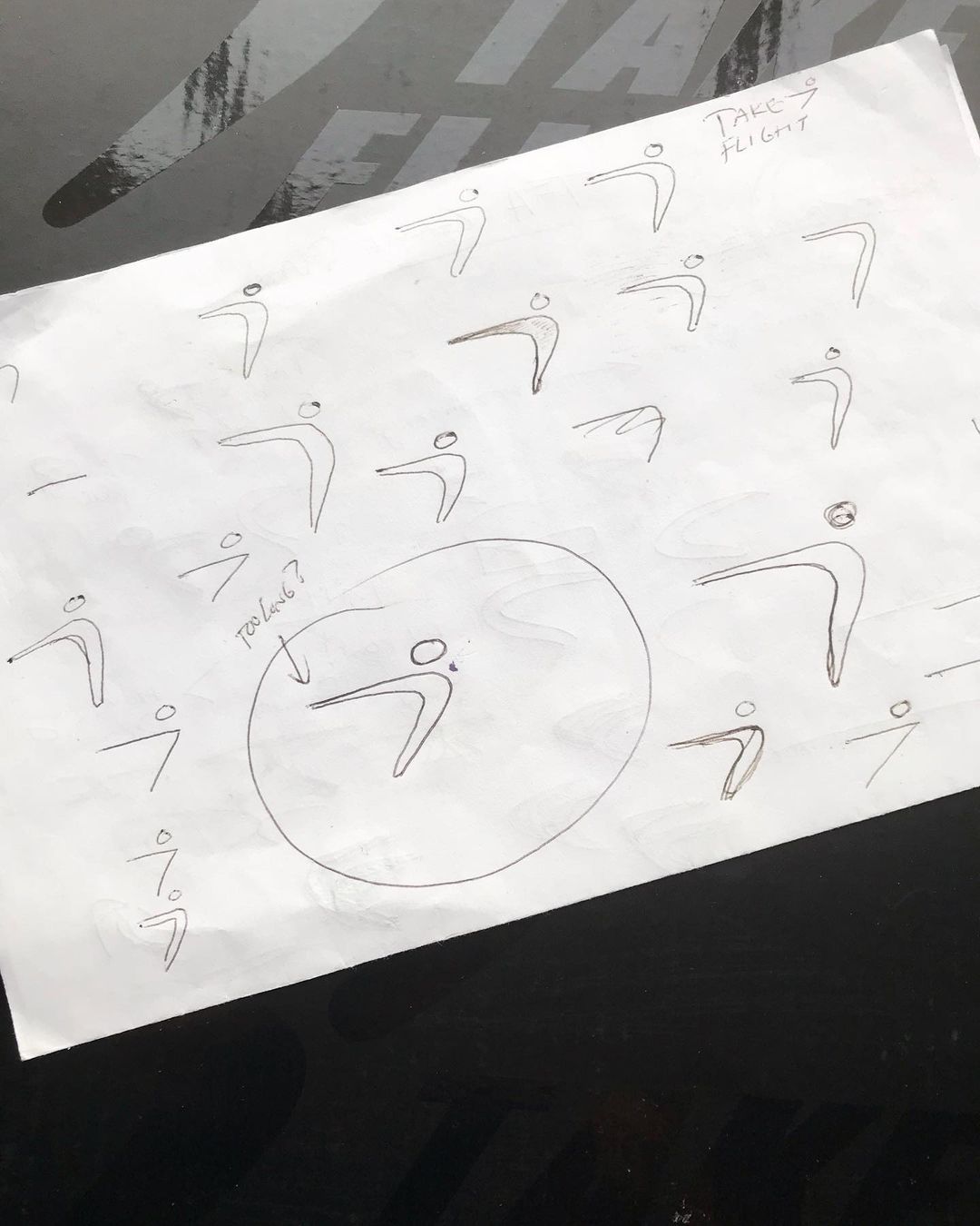
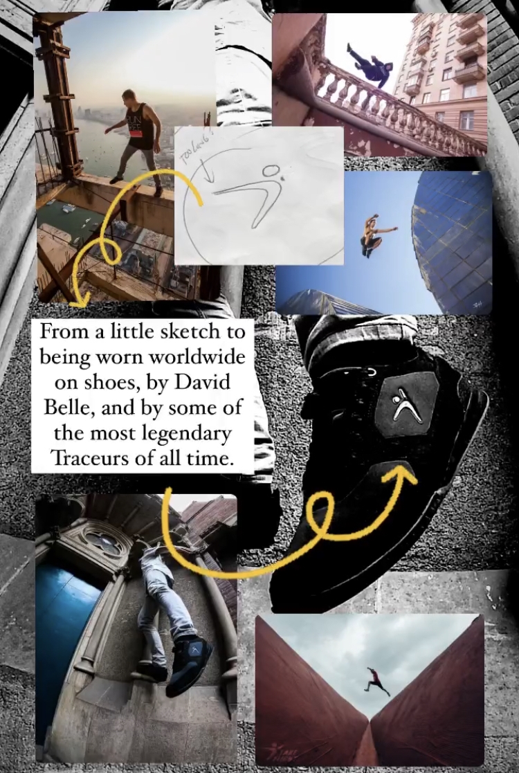
 What follows is a photo of the first Flight Man ever drawn! Sketched circa spring 2009. It made us realized, we've never told the story behind the design. Well, here it is.
In 2008, Take Flight founder Adam Dunlap decided he wanted to start a Parkour clothing company. No Parkour clothing companies yet existed in the world, so it seemed like an amazing idea. Amazingly, in his mind, the principle problem wasn't making the clothing. It was choosing a name and designing a logo!
For 6 months, AD worked on logo concepts. He had zero design background, but he did have some foundational concepts in mind to guide the approach. He wanted the logo to be:
-Gender neutral
-Race neutral
-Species neutral*
-Athletically neutral yet Parkour specific
-Powerful in black and white
-Easily drawable so that people could sketch the design on their binders when they were bored in school
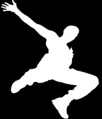
In spite of the vision and countless hours of work put into the concept, AD couldn't make a logo he liked. He even did a Parkour photo shoot and hung those photos in a window to trace the silhouettes hoping to land on some cool design that was as inspirational as the original Parkour logo by David Belle. Nothing seemed to work.

.
Then one day in spring 2009 AD was driving home, and, we kid you not, on the back of a dirty moving truck he saw a shape etched out in the dirt, presumably by the wind. The light bulb went off.
When AD arrived home he grabbed a piece of paper and a pen. This circled Flight Man? That is literally the very, very, VERY first sketch he made attempting to recreate what he saw on the back of that truck. AD added a head to it, and a few days later, an advisor commented that the logo looked like it was missing something. The advisor recommended adding an arm, which AD did.
In almost 14 years the logo has never changed which we think is pretty cool! And not only does it have a cool story, we still have the original sketch.
(The second image are other sketches made in an attempt to improve the logo. But AD ultimately felt it was perfect as originally drawn)
*Species neutral? AD has been quoted as saying he wanted a logo that would resonate throughout the universe, so that even aliens would relate to it.


